Zylocore Games: A gaming identity built to hit hard
Year
2026
Disciplines
Branding / Identity Design
What is Zylocore Games?
Zylocore Games is an identity design project spanning logo development, color, typography, texture and repeatable brand patterns.

Challenge
Build a gaming identity with enough force to feel immediate, without collapsing into familiar esports visual clichés.
Approach
Start with the mark. Sketch broadly, reduce the strongest forms, then build a modular system around a sharp Z icon, an extended wordmark, controlled texture and a concentrated red spectrum.
Outcome
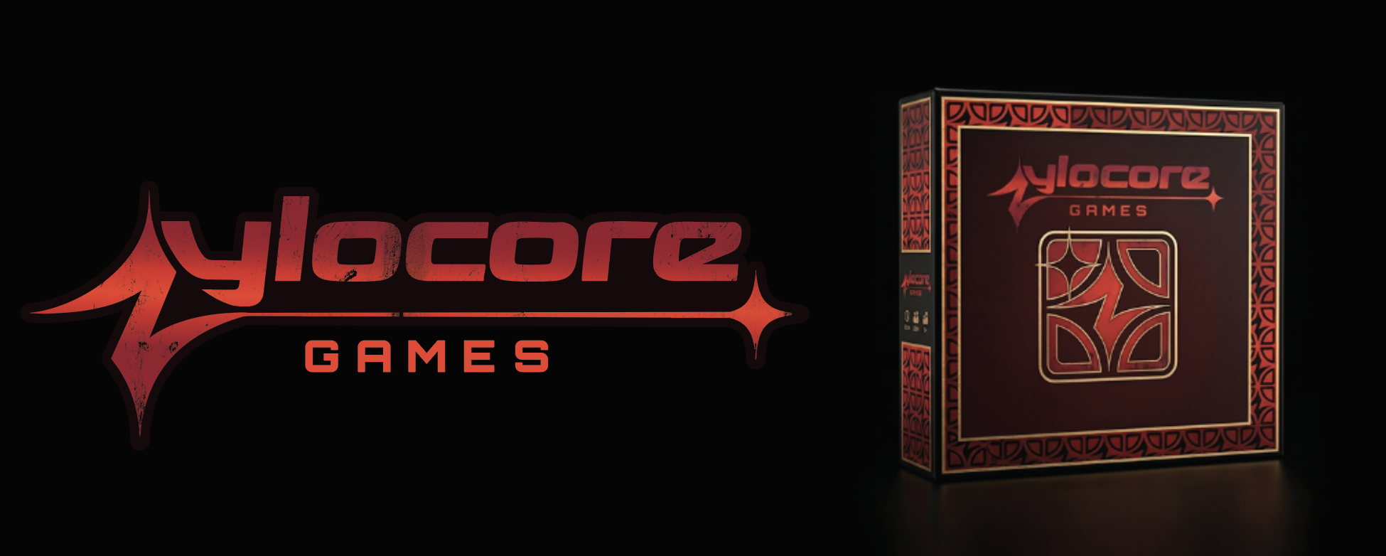
A recognizable identity system that can move from a small interface icon to merchandise, packaging, environmental graphics and full-width digital applications.
Process
Early ideation & sketches
The system began by testing the tension between a readable Z and a more aggressive, abstract symbol. The strongest routes were refined for weight, speed and recognition at small sizes.
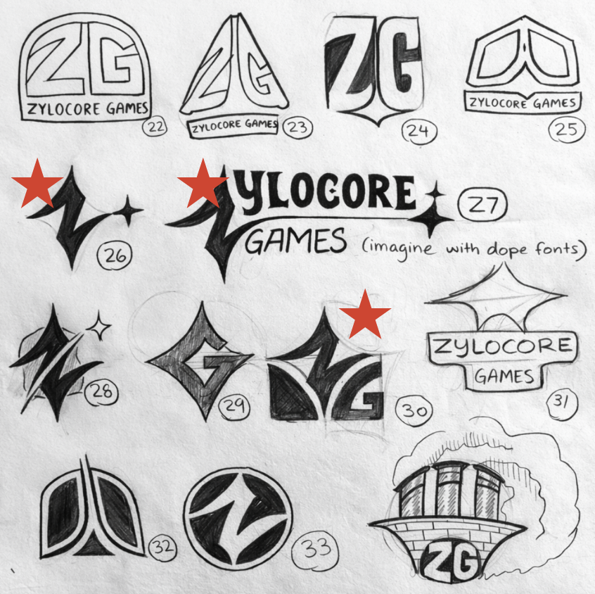
Logo sketches
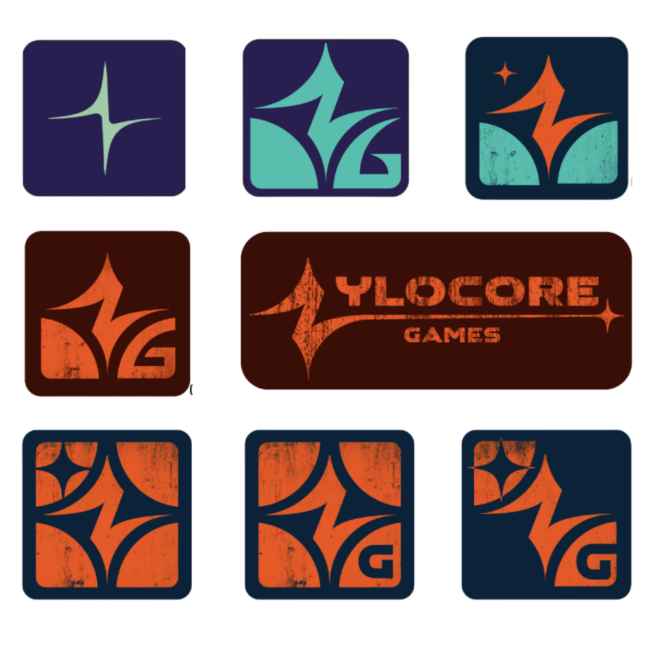
Early logo concepts
Identity
Logo system
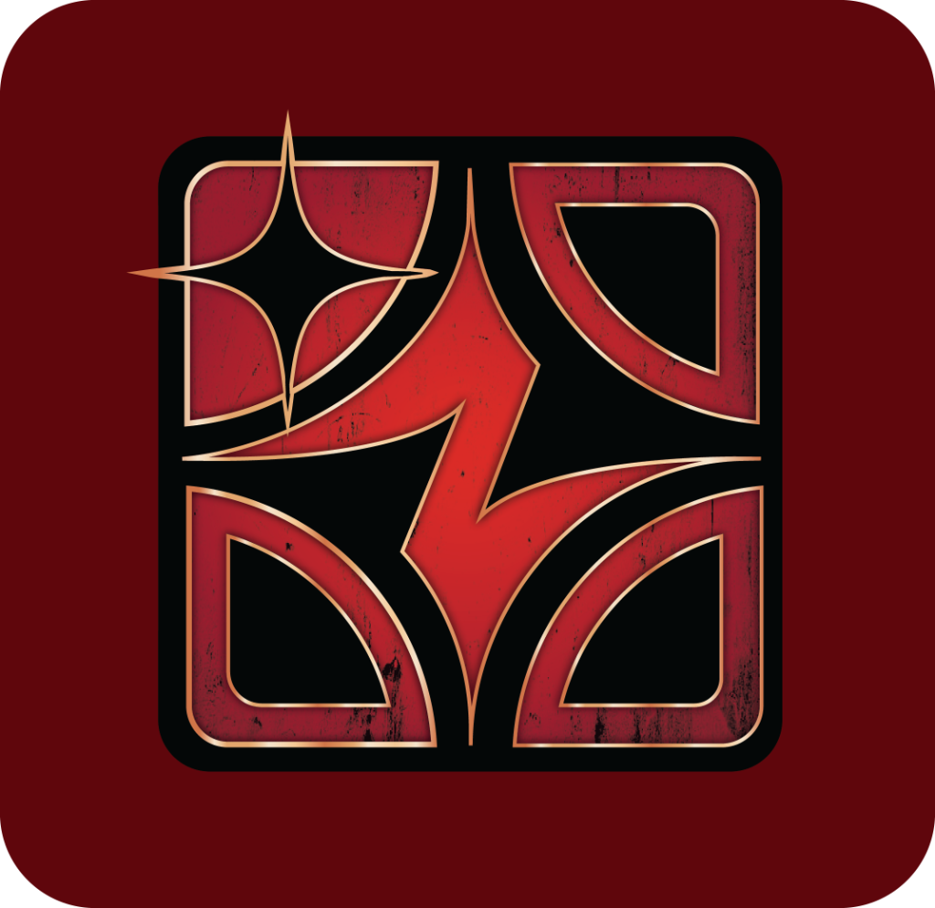
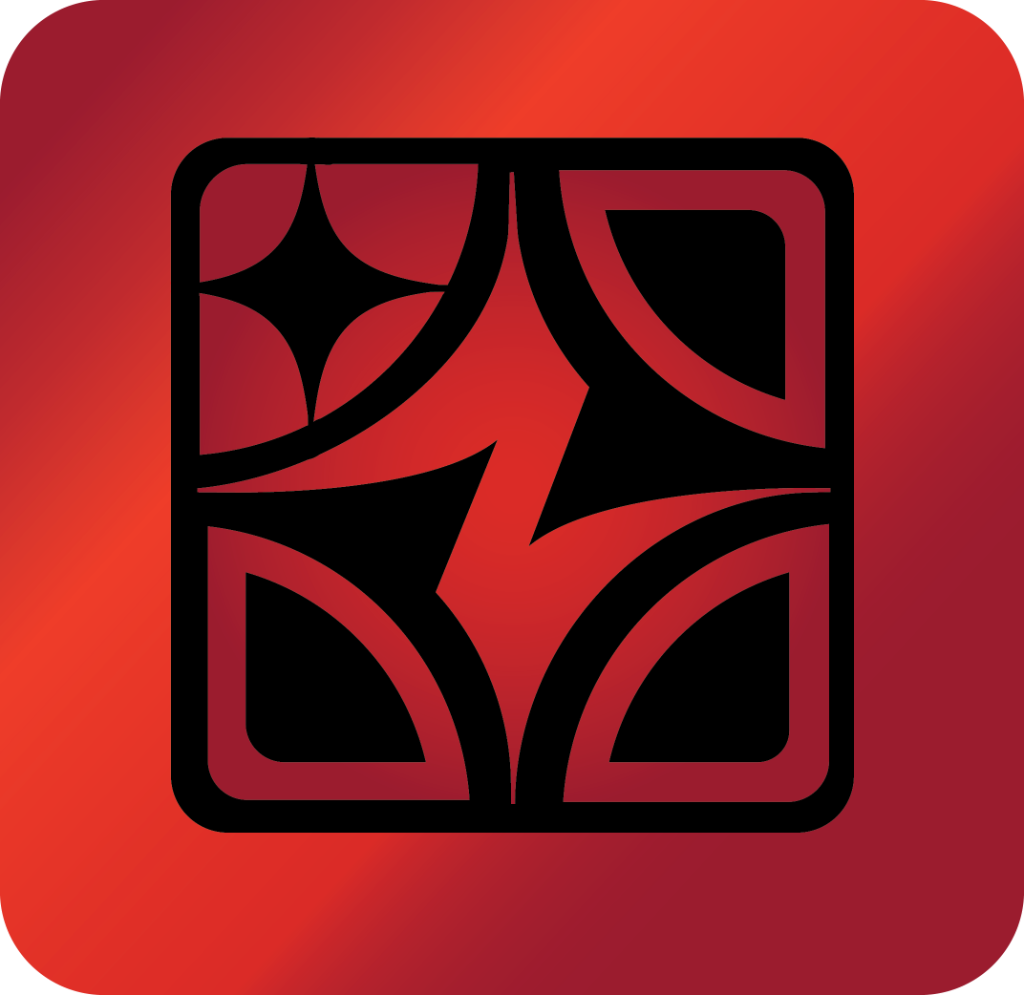
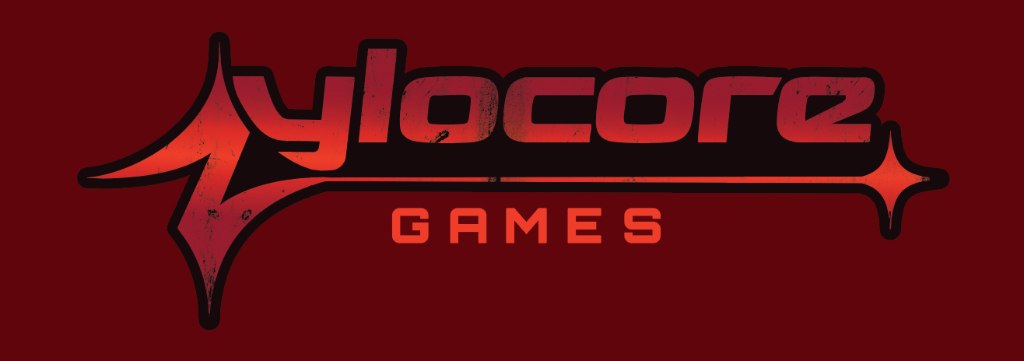
The primary icon carries the identity at speed. A modernized variation sharpens the geometry, while the long-form wordmark and secondary mark give the system room to adapt.
Primary icon
Modernized icon
Long-form wordmark

Secondary mark
- 01Use on dark or richly colored backgrounds.
- 02Keep clear space equal to the height of the Z on all sides.
- 03Never stretch, skew, rotate or alter the mark’s proportions.
- 04Grunge texture belongs on the icon only, never the typography.
- 05Minimum size: 32px digital or 0.5 inches in print.
Visual language
Gradients & texture
Controlled gradients create depth. A rough grunge layer adds energy without compromising the underlying geometry.
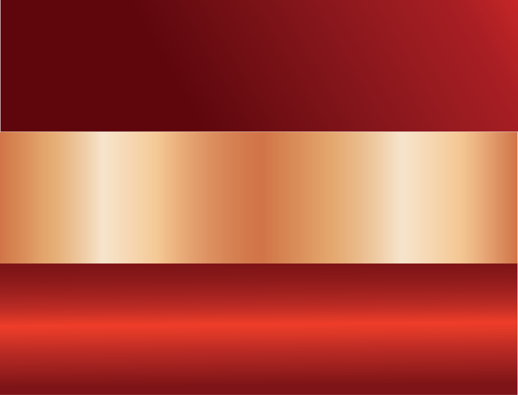
Brand gradients
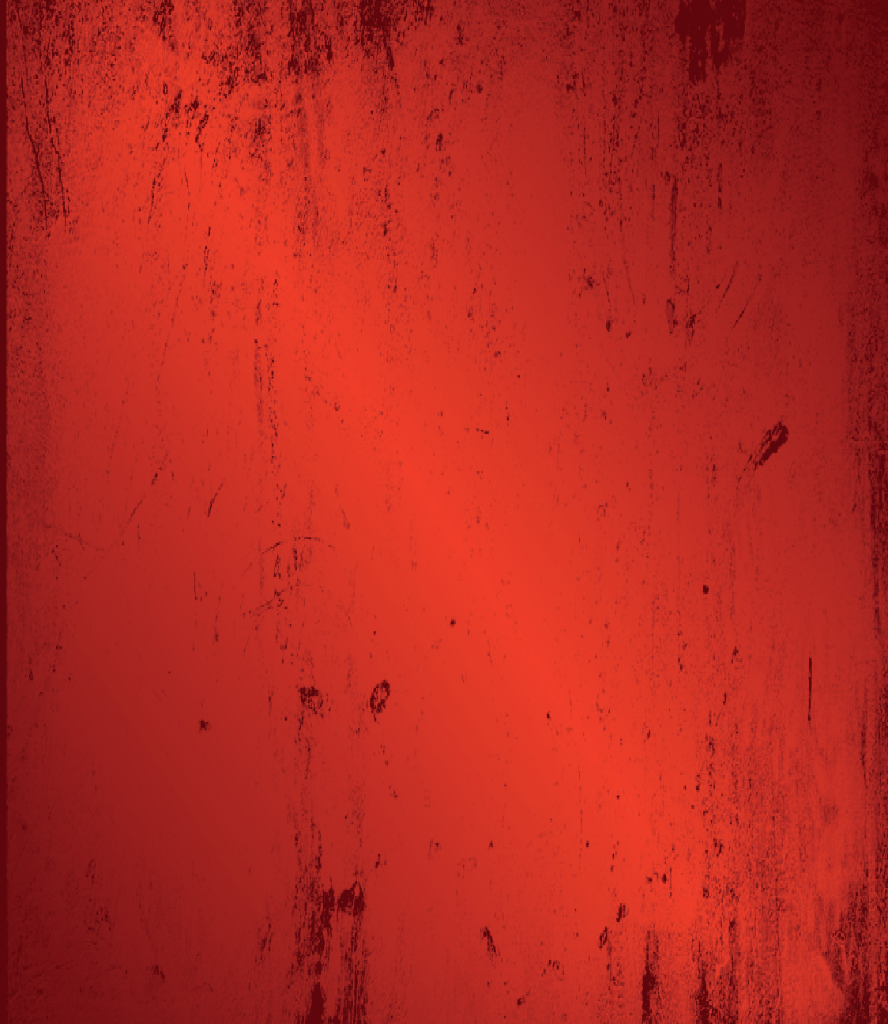
Grunge texture
Design assets
Pattern system
The patterns extend the icon into a larger visual field. They stay large enough to preserve detail and rely on form and color rather than excessive effects.
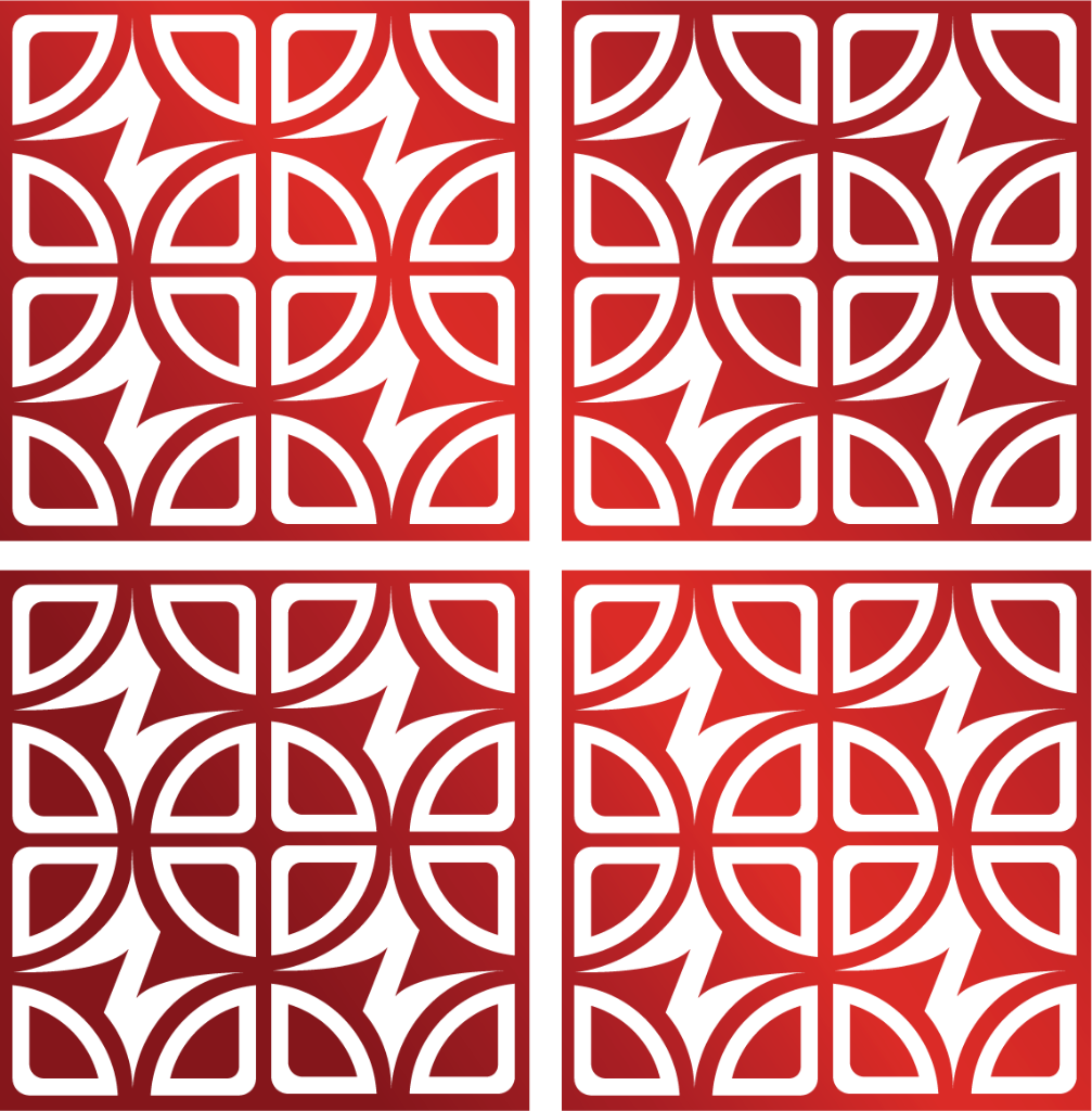
Pattern 01
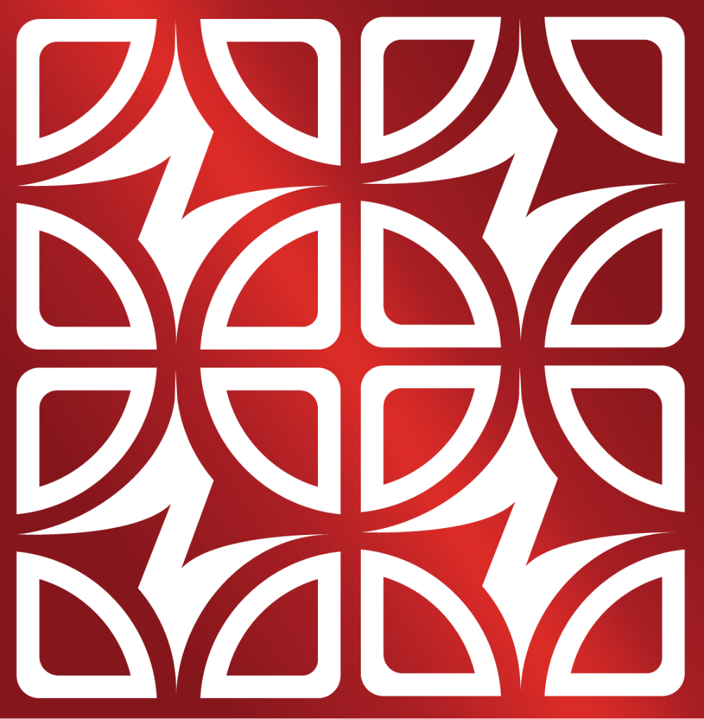
Pattern 02
- 01Print backgrounds
- 02Packaging and merchandise
- 03Digital headers
- 04Large-scale environmental graphics
Typography
Orbitron leads the identity. Verdana handles supporting interface copy. Roboto carries longer reading.
Orbitron
Headlines · Display · 72pt+
Verdana
Subheads · UI · 48pt
Roboto
Body · Captions · 36pt
Zylocore Games’s graphic design is
- Sharp.
- Modular.
- Kinetic.
Let the form and color do the work.
Color experience
Red, under pressure
Three reds create heat and hierarchy against a near-black field. White is held back for clarity and contrast.
The palette is deliberately narrow so the symbol remains the loudest part of the system.
Brand palette
Dark Red
#5F060C
PANTONE 7421 C
Mid Red
#A81F24
PANTONE 7427 C
Bright Red
#EF3E2A
PANTONE Bright Red C
Black
#121315
PANTONE Black 6 C
White
#FFFFFF
PANTONE White