Grasp: Support that never sounds like a shortcut
Year
2026
Disciplines
Brand Strategy / Visual Identity
What is Grasp?
Grasp is free academic support for adult English language learners.
It strengthens a student's own effort instead of replacing it, bridging the gap between listening and comprehension.
While other tools sell technology, Grasp shows what students can do with the right support.
Context
Executive summary
Multilingual learners spend far longer on coursework than their peers, and the gap is economic as well as academic: immigrants with a bachelor's degree earn nearly $20,000 more each year than those with no education past high school. The brief was to use AI to support English language learners without creating dependency, so Grasp, free and nonprofit, lives inside a student's existing coursework rather than becoming another standalone app. The primary user is an intermediate learner in college or university; institutional buyers include ESL directors, student success offices and international student organizations. Academic research identified the post-K-12 support gap, interviews with learners and educators confirmed it, and the pilot will measure reading time, lecture comprehension, assignment performance, confidence and continued use.

Challenge
Structured language support largely disappears after high school. One student spent six to seven hours on a reading assignment her classmates finished in two. Existing tools led with technology, which learners often saw as a shortcut or crutch.
Approach
We positioned Grasp as academic scaffolding, not another language app. Every line puts the student before the machine. A friendly, matter-of-fact voice and the almost-readable Grasp tangle make language support feel human, credible and clear.
Outcome
A brand students can trust and institutions can champion. The strategy, identity and outreach plan debuted at the OIC showcase, with a path to market through ESL directors, language centers and community colleges.
Brand strategy
Lead with people, not product
Over 55% of audiences say they are uncomfortable with artificial intelligence. Any brand built on it starts the conversation in a hole.
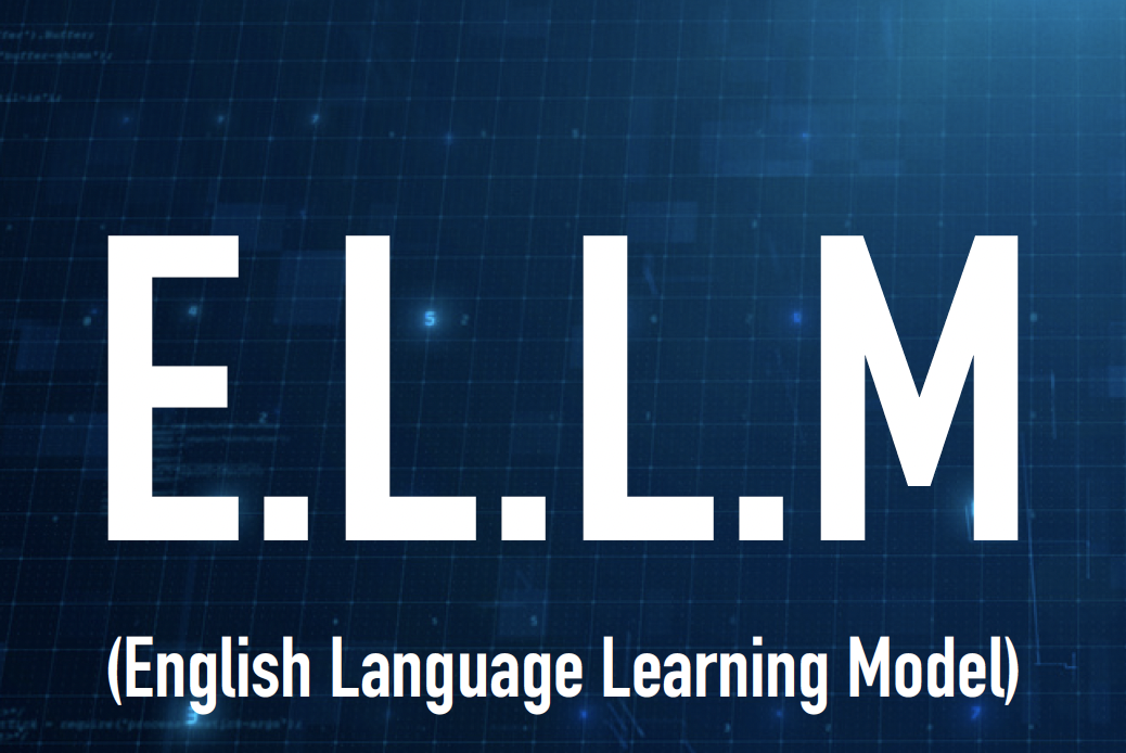
Grasp began as ELLM, the English Language Learning Model, wrapped in blue tech branding. Technology-led pitches lost the room. Student-led pitches kept it.
The lesson: the brand is the people and the impact, not the product.
The product addresses the learning gap. The identity addresses user comfort through deliberate design.
Before
After
ELLM, the blue tech original, next to Grasp after the rebrand.
Brand values
01
Be people first
We operate to advance equity, and to remove barriers to education.
02
Respect the student
We always treat the student as an intellectual equal.
03
Give agency
We are here to foster independence rather than creating a crutch.
04
Humility
We adapt to the student, so they never have to assimilate to machine logic.
Tone of voice
More this
- Empowering
- Credible
- Engaging
- Candid
- Creative
- Approachable
Less this
- Corny
- Clinical
- Childish
- Vulgar
- Artsy
- Unprofessional
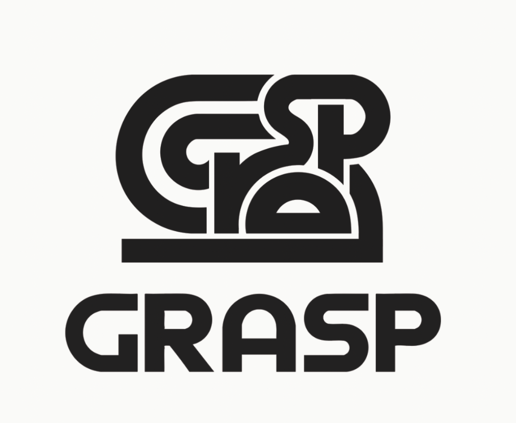
The logo
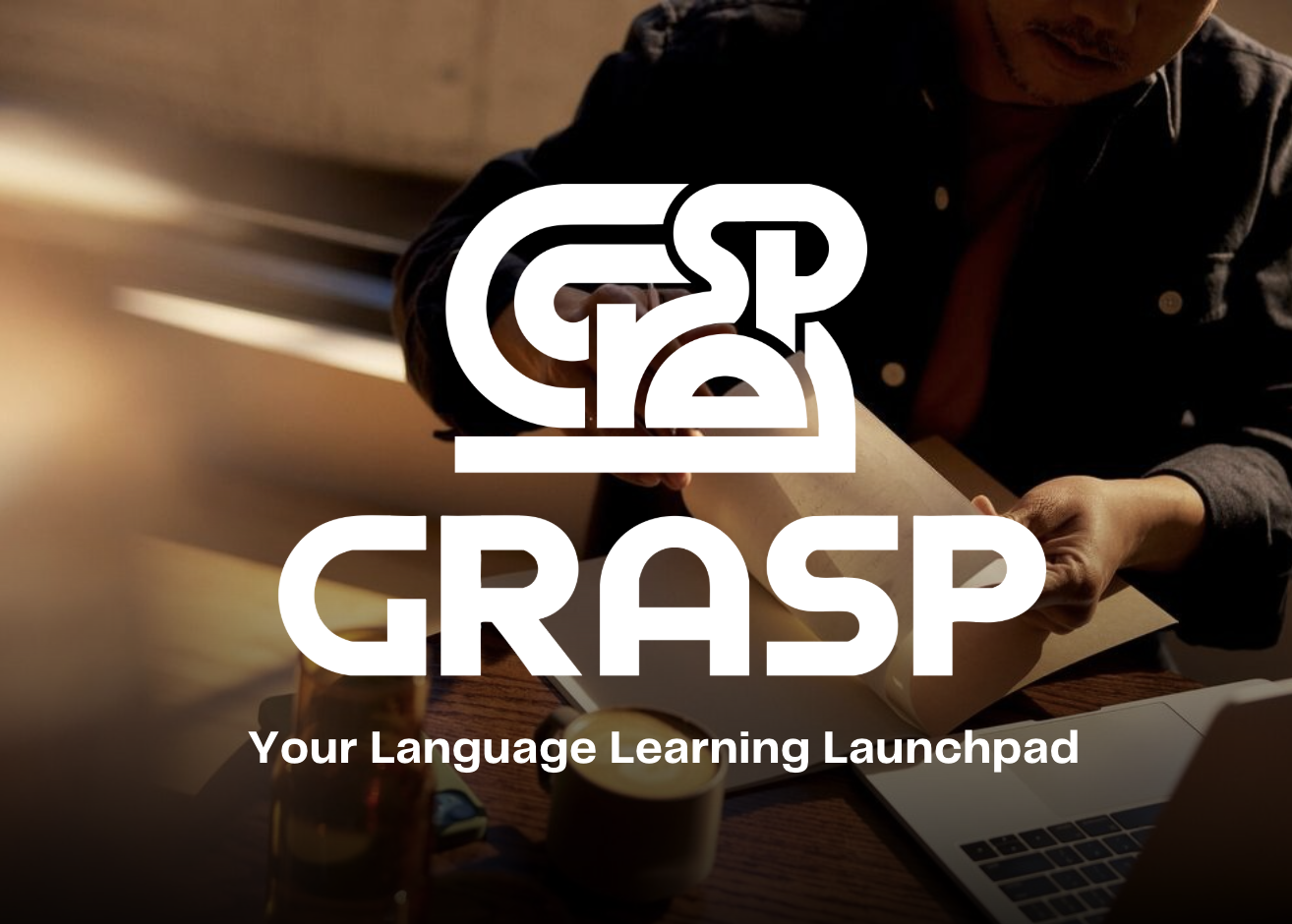
The Grasp tangle is built to look like an almost readable word. It is the feeling of recognising language before you fully understand it.
GRASP sits beneath it in a matching line weight, translating the lines above. The mark performs the product.
Typography design
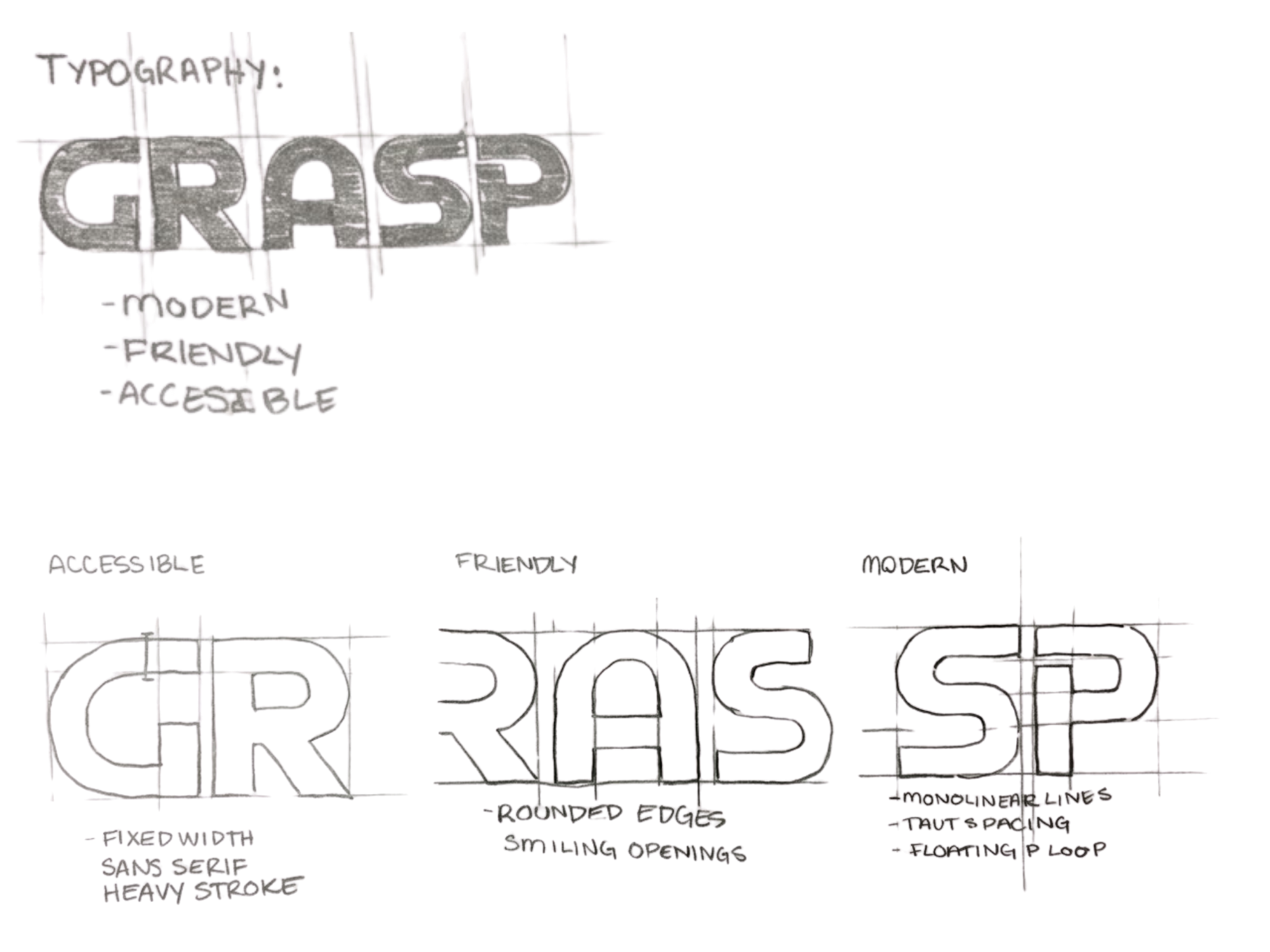
The wordmark is drawn, not set. Line weight and terminals are tuned to the tangle above it.
Secondary mark
The tangle crowds at small sizes. Tab icons, watermarks and avatars switch to the secondary mark so the idea survives the scale.

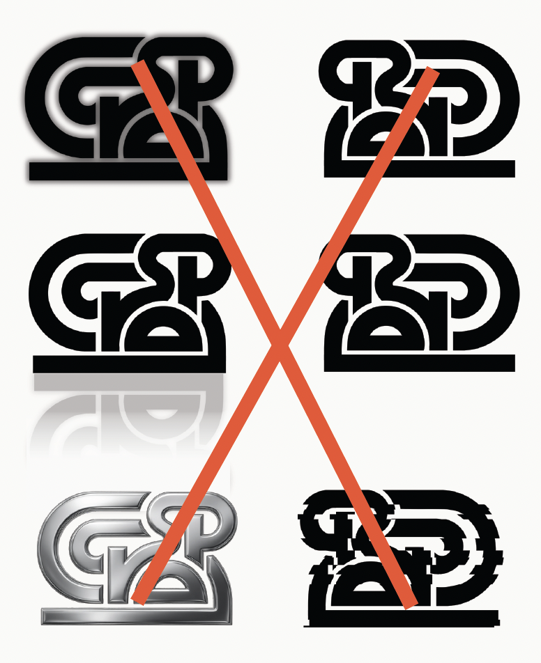
Logo no-gos
Never tilt it. Never distort it. No drop shadows, no outlines, no filters. Official variations only.
Logo over images
The logo sits on photography only where it stays fully legible. Color is picked from the nearest approved combination so contrast holds.
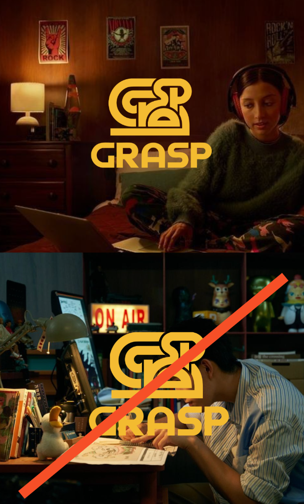
Image direction
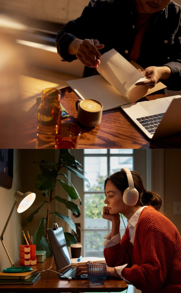
Photography
Warm, crisp and focused. The camera stays close to the work and the moments around it.
Subjects appear focused, frustrated or relieved, never posed. Natural light, real materials and purposeful framing keep the images human and professional.
Typography
Cal Sans was chosen for a friendly face and high readability. Figtree carries the body.
Headline
Cal Sans 80
Subhead
Cal Sans 40
Body
Figtree 32
Grasp’s graphic design is
- Clean.
- Creative.
- Upbeat.
When in doubt, remove, don't add.
Color experience
Grasp is purple
White, charcoal and tangerine create a sharp, professional base. Deliberate color adds humanity to the academic frame.
Purple is the accent, not the wallpaper. It replaces cold tech blue with something warmer and more human.
Primary palette
Purple
#52478b
PANTONE 7671 C
Snow White
#fbfbf7
PANTONE 11-0602 TCX
Charcoal
#2f2e2c
PANTONE Process Black C
Supporting palette
Peach
#fda38b
PANTONE 1625 C
Amber
#f1b732
PANTONE 7409 XGC
Signal
#fc4716
PANTONE 172 C
Olive
#5f6939
PANTONE 5753 C
What the product does
- Live lecture translation
- Dual-immersion tutoring
- Textbook translation
- Presentation practice
16
Interviews across educators, learners and AI practitioners
3+
Pilot partnerships targeted in year one
70%
Student-reported confidence improvement goal